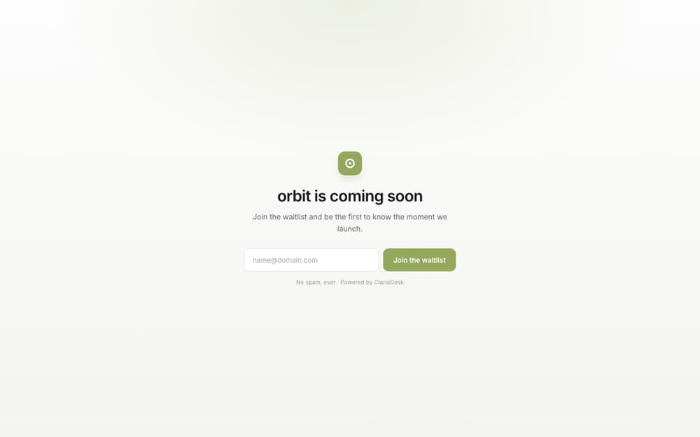
Editorial
A clean, centered card that puts your message first. Timeless, fast, and on-brand out of the box — the default.
Best for any app that wants a no-fuss page.
Every ClarioDesk app gets a hosted waitlist page. Pick one of seven designed templates, edit it without code, and arrive at launch day with your customer list already inside the platform.
A clean, centered card that puts your message first. Timeless, fast, and on-brand out of the box — the default.
Best for any app that wants a no-fuss page.
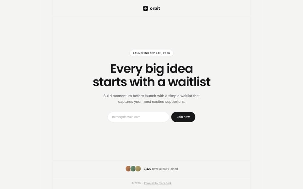
A framed hairline grid with a launch-date pill, an inline pill form, and a proof strip of your earliest members.
Best for design-led products that want a restrained, premium look.
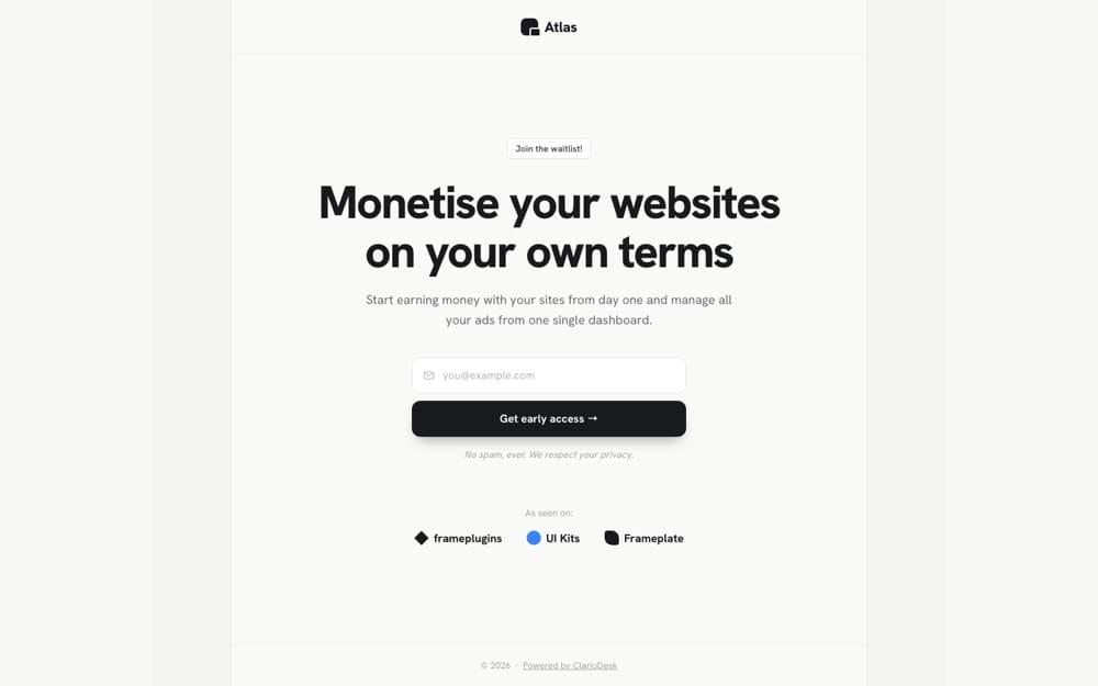
Chunky grotesque type, a stacked field with a full-width CTA, and a wall of the logos you're backed by.
Best for bold brands and indie hackers showing traction.
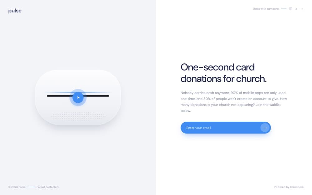
A 50/50 layout with a product screenshot — or an embedded YouTube, Vimeo, or Loom video — beside your copy.
Best for apps with a strong visual or a demo to show.
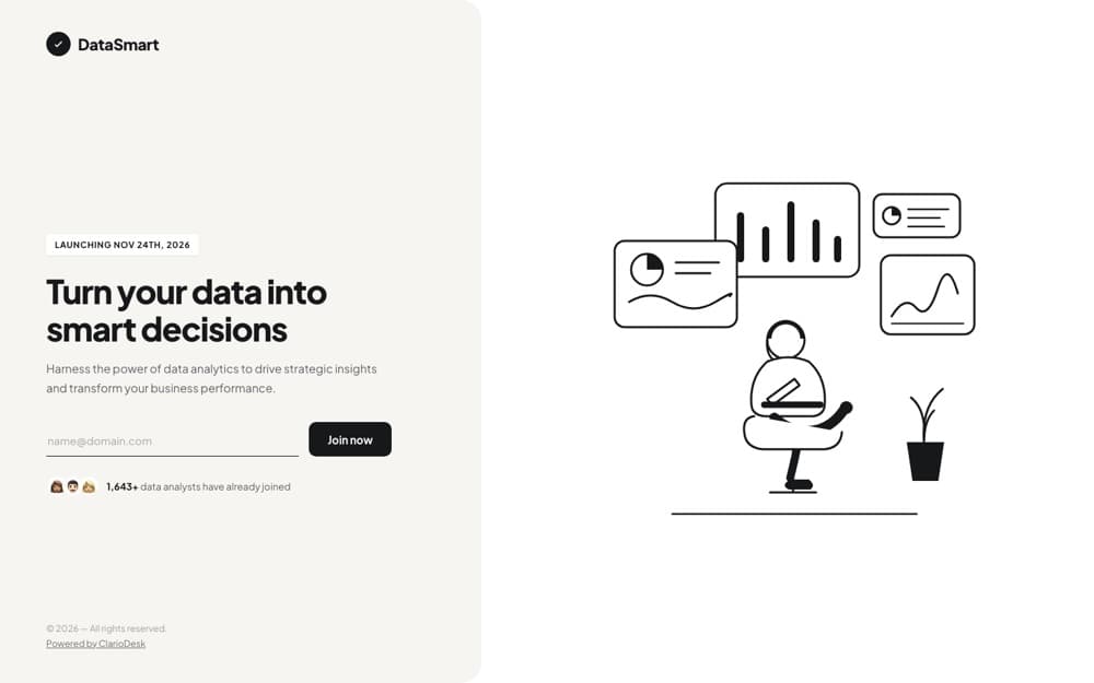
A cream copy panel with an underline input, paired with a line-art scene tinted to your accent. No assets needed.
Best for friendly, approachable products.
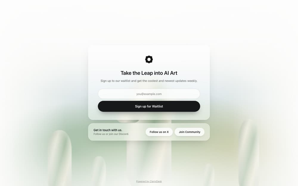 Light theme
A full-bleed background image under frosted-glass cards, one big call to action, and a social strip.
Best for lifestyle and media apps with striking imagery.
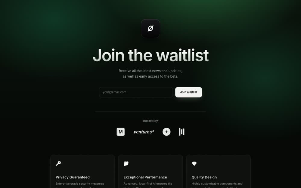 Dark theme
A grainy dark-aurora hero with a gradient headline, a logo wall, and a grid of feature cards.
Best for AI, dev tools, and apps that live in dark mode.
Switch templates any time without losing a word of your content — the editor shows just the slots the layout uses and keeps the rest. Theme, accent, and fonts carry across every one.